

Table of contents
The css box model is a box that wraps around every HTML element, in other words it is a container that has margins, padding, height, width and the content itself. This article is the honest try to explain box model in simpler way and make more understandable.
Block and inline boxes
Every element in css has the box around it, in css we broadly have two types of boxes block boxes and inline boxes. The type refers to how the box behaves in terms of page flow and in relation to other boxes on the page. Boxes have an inner display type and an outer display type.
Outer display type
If a box has an outer display type as block then:
- The box will break into new line.
-The height and width properties are respected.
-The margin, padding and boarder will cause other elements to be pushed away from the box.
Example:
<style>
    h1{
        background-color: green;
        margin: 30px;
        padding: 50px;
        border: 2px solid black;
    }
    div {
        background-color: greenyellow;
    }
    p{
        background-color: yellow;
    }
</style>
<body>
<h1>Heading</h1>
    <div>Div</div>
    <p>Paragraph</p>
</body>
Output:
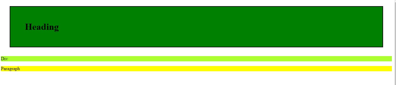
In above example we have used the div, p and h1 tags of html which has the block as there outer display type by default. Each tag is started on a new line.
If a box has an outer display type of inline then:
The box will not break into a new line.
The height and width property will not apply
Vertical padding, margins, and borders will apply but will not cause other inline boxes to move away from the box.
- Horizontal padding, margins, and borders will apply and will cause other inline boxes to move away from the box.
Example:
<style>
 span{
        background-color: palevioletred;
        padding: 50px;
        box-sizing: border-box;
        height: 500px;
        margin-left: 50px;
    }
    a{
        background-color: pink;
    }
    </style>
<body>
    <span>Span</span>
    <a href="https://www.google.com/"> Google</a>
</body>
Output:
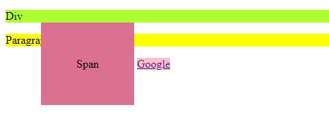
In above example we have used span and a tags of html which have the inline as their outer display type by default. margin-left cause to shift the a tag to the right side but padding from top side overlaps on the above element.
Inner display type
Boxes also have an inner display type, which dictates how elements inside that box are laid out. Block and inline layout is the default way things behave on the web.
You can change the inner display type for example by setting display: grid;. The element will still use the outer display type block but this changes the inner display type to grid. Any direct children of this box will become grid items and behave according to the Grid specification.
There are multiple display types:
display: flex;
display: grid;
display: inline;
display: block;
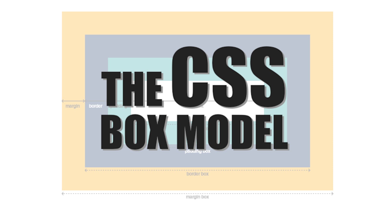
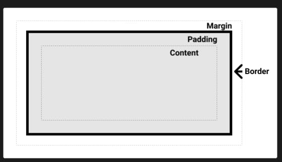
What is css box model
The CSS box model as a whole applies to block boxes and defines how the different parts of a box — margin, border, padding, and content — work together to create a box that you can see on a page.
Parts of a box:
To make a css block box we have
Content: The area where the content is displayed. To give the size to that area we have properties called height, width, inline-size, block-size.
Padding:The padding sits around the content as white space; size it using padding and related properties.
Border: The border box wraps the content and any padding; size it using border and related properties.
Margin : The margin is the outermost layer, wrapping the content, padding, and border as whitespace between this box and other elements; size it using margin and related properties.
Here is the view of above four layers
There are a standard and an alternate box model. By default, browsers use the standard box model.
Standard box model
In the standard box model when you have content box with the width and height attribute, if you apply any padding and boarder to that box then it will get added to those dimensions to get the total size taken up by the box.
Example:
<style>
.standard{
height: 200px;
width: 500px;
border: 5px solid black;
padding: 20px;
background-color: greenyellow;
}
</style>
<body>
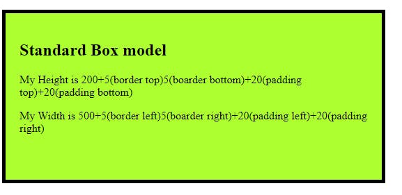
<div class="standard">
<h2>Standard Box model</h2>
<p>My Height is 200+5(border top)5(boarder bottom)+20(padding top)+20(padding bottom)</p>
<p>My Width is 500+5(border left)5(boarder right)+20(padding left)+20(padding right)</p>
</div>
</body>
Output:
In above example we have a box with height and width attributes and we have applied the boarder and padding to the content of that box which get added to the total space taken by the box.
Height = 200(height)+5(border top)5(boarder bottom)+20(padding top)+20(padding bottom).
Width = 500(width)+5(border left)5(boarder right)+20(padding left)+20(padding right).
Note: The margin is not counted towards the actual size of the box — sure, it affects the total space that the box will take up on the page, but only the space outside the box. The box's area stops at the border — it does not extend into the margin.
Alternative box model
In alternative box model the width is the width visible box on the page. The content area width is that width minus the width for the padding and border.
To set the alternative model for an element, set box-sizing: border-box on it:
.box {
  box-sizing: border-box;
}
Consider above example itself and we have box-sizing: border-box; set to that box then
Height = 200 and width = 500 is the actual space taken by the box. No need to add any paddings and boarders value separately.
border-box; is a common choice among developers.
Note: An interesting bit of history — Internet Explorer used to default to the alternative box model, with no mechanism available to switch.
Example:
<style>
 .standard{
        height: 200px;
        width: 500px;
        margin-top: 30px;
        border: 5px solid black;
        padding: 20px;
        background-color: greenyellow;
    }
    .alternate{
        height: 200px;
        width: 500px;
        margin-top: 30px;
        border: 5px solid black;
        padding: 20px;
        background-color: greenyellow;
        box-sizing: border-box;
    }
    </style>

<body>
 <div class="standard">
        <h2>Standard Box model</h2>
    </div>
    <div class="alternate">
        <h2>Alternate Box model</h2>
    </div>
<body>
Output:
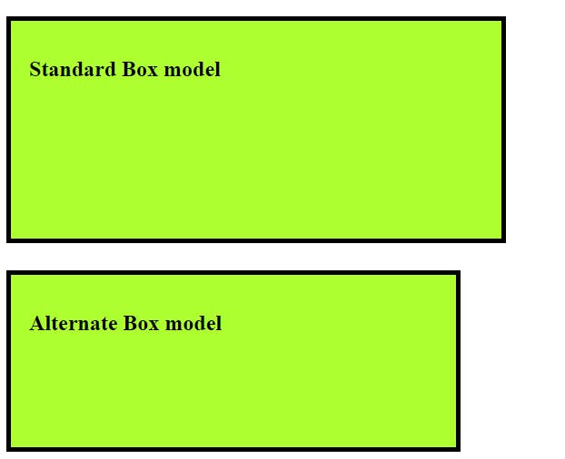
In above example the the second box have the alternate css box model type that is the only difference here.
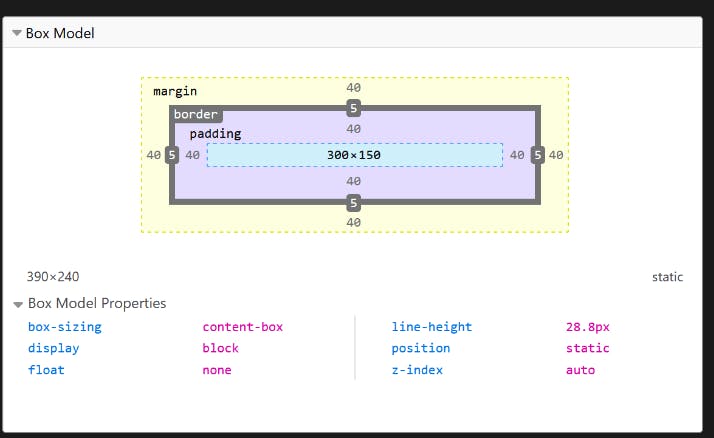
Use browser DevTools to view the box model
Your browser developer tools can make understanding the box model far easier. If you inspect an element in Firefox's DevTools, you can see the size of the element plus its margin, padding, and border. Inspecting an element in this way is a great way to find out if your box is really the size you think it is!
GitHub Link: Check here