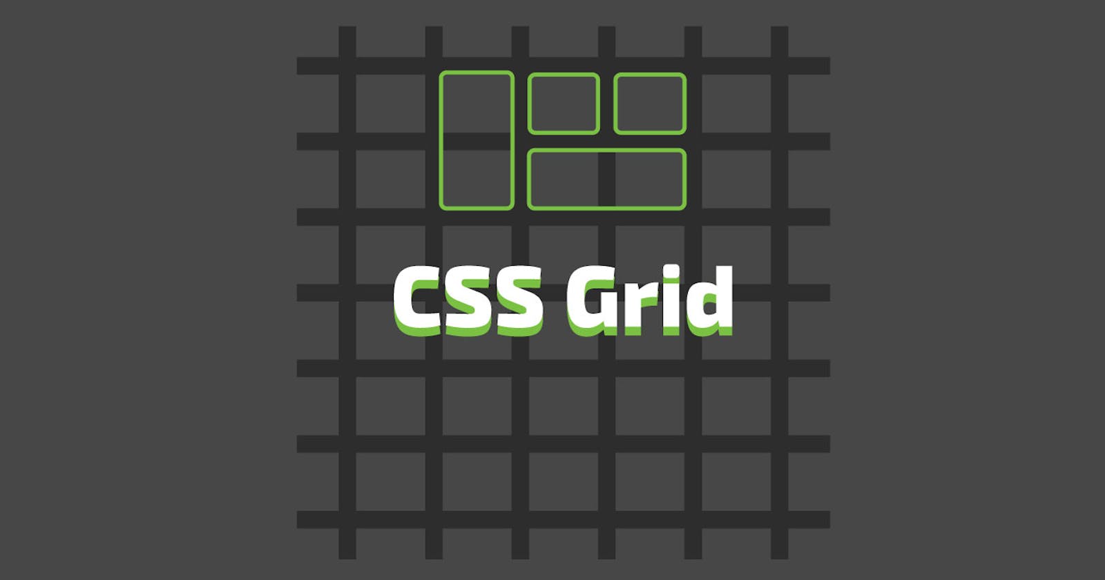


There are multiple ways through which the layout of your web page can be designed,Grid is one of them. Grid is two-dimensional(rows and column) grid based design layout system. The guide is the honest try to make you comfortable with Grid and help you to better understand the Grid layout. Grid is one of the most powerful CSS modules ever introduced.
CSS Grid properties for the Parent Container
1.display
display is the property which states that how the element will get structured as a block element or inline element. Once display property is set the it will established the way of formatting for its children ex. flow layout, grid or flex.
.container {
display: grid | inline-grid
}
grid generates a block level grid
inline-grid generates a inline level grid
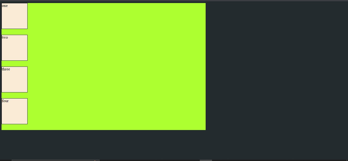
Example:
<style>
        body{
            background:  #242B2E;;
        }
        .container{
            height: 500px;
            width: 800px;
            background-color: greenyellow;
            display: grid;
        }
        .one {
            height: 100px;
            width: 100px;
            background-color: antiquewhite;
            border: 1px solid black;
        }
    </style>

<body>
    <div class="container">
        <div class="one">one</div>
        <div class="one">two</div>
        <div class="one">three</div>
        <div class="one">four</div>
    </div>
</body>
output:
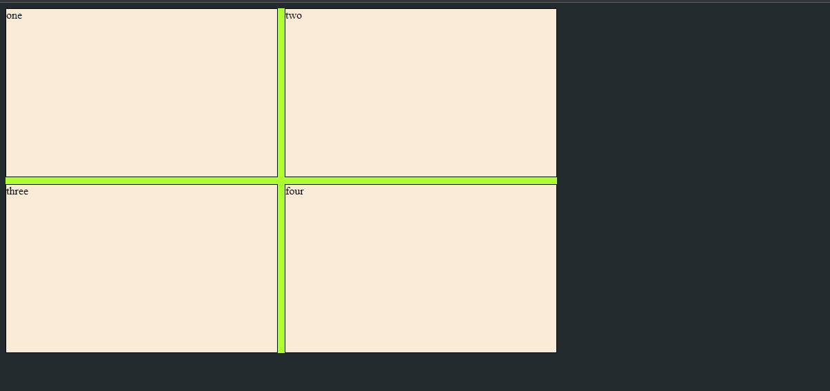
2.grid templet columns
Defines the column of the grid with space separated list of values.
.container {
  grid-template-columns: ...  ...;
  /* e.g.
      1fr 1fr
      minmax(10px, 1fr) 3fr
      repeat(5, 1fr)
      50px auto 100px 1fr
  */
}
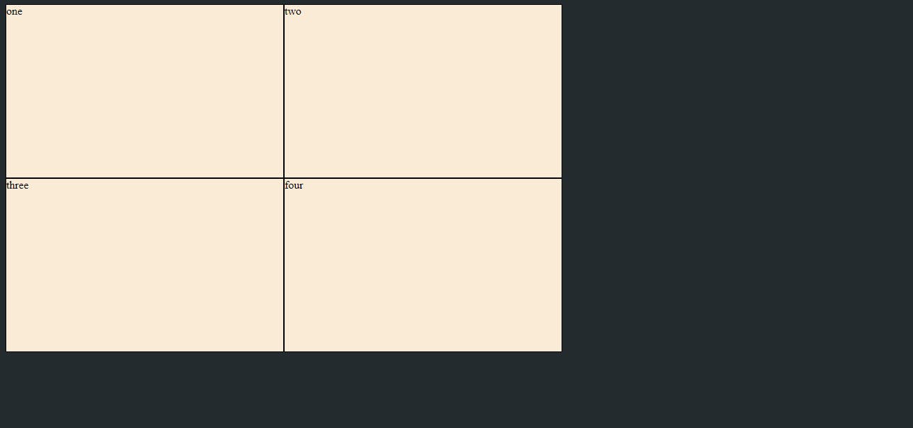
Example:
 <style>
        body{
            background:  #242B2E;;
        }
        .container{
            height: 500px;
            width: 800px;
            background-color: greenyellow;
            display: grid;
            grid-template-columns: 1fr 1fr;
        }
        .one {
            background-color: antiquewhite;
            border: 1px solid black;
        }
    </style>
<body>
    <div class="container">
        <div class="one">one</div>
        <div class="one">two</div>
        <div class="one">three</div>
        <div class="one">four</div>
    </div>
output:
3.grid templet rows
Defines the rows of the grid with space separated list of values.
.container {
  grid-template-rows: ... ...;
  /* e.g.
      min-content 1fr min-content
      100px 1fr max-content
  */
}
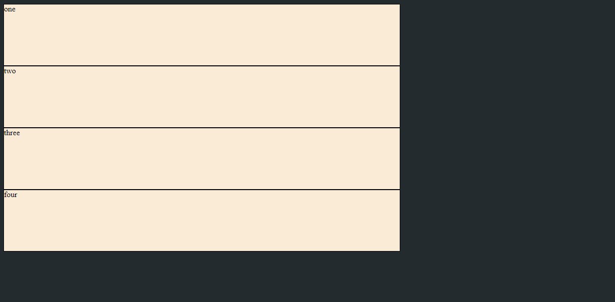
Example:
 <style>
        body{
            background:  #242B2E;;
        }
        .container{
            height: 500px;
            width: 800px;
            background-color: greenyellow;
            display: grid;
            grid-template-rows: 1fr 1fr 1fr 1fr;
        }
        .one {
            background-color: antiquewhite;
            border: 1px solid black;
        }
    </style>
<body>
    <div class="container">
        <div class="one">one</div>
        <div class="one">two</div>
        <div class="one">three</div>
        <div class="one">four</div>
    </div>
</body>
output:
From above examples fr unit allows you to set the size of a track as a fraction of the free space of the grid container. For example,
.container {
  grid-template-columns: 1fr 1fr 1fr;
}
this will set each item to one third the width of the grid container:
4.grid template
grid-template is the shorthand property to set grid-rows, grid-columns and grid-areas in a single declaration.
.container {
  grid-template: grid-template-areas  | <grid-template-rows> / <grid-template-columns>;
}
5.grid gap
gap is the property through which you can set the spacing between grids.
column-gap - specifies the gap between the grid columns
row-gap - specifies the gap between the grid rows
the shorthand to this is you can use the gap property to set rows and columns gap in single declaration
.container {
column-gap : 10px;
row-gap: 10px;
// sets the spacing between rows and column as 10 px;

// shorthand by using gap
gap: 10px 10px;
will do the same thing
If only one value is given like gap:10px, then it will get applied to both rows and column gaps.
Example:
 <style>
        body {
            background: #242B2E;
            ;
        }

        .container {
            height: 500px;
            width: 800px;
            background-color: greenyellow;
            display: grid;
            grid-template-columns: 1fr 1fr;
            grid-template-rows: 1fr 1fr;
            /* column-gap: 10px;
                row-gap: 10px; */
                gap:10px 10px;        }

        .one {
            background-color: antiquewhite;
            border: 1px solid black;
        }
    </style>

<body>
    <div class="container">
        <div class="one">one</div>
        <div class="one">two</div>
        <div class="one">three</div>
        <div class="one">four</div>
    </div>

</body>
output:
6.justify items
justify-items property align grid items along the inline(row) axis. This value is applied to all grid items present in the grid.
values for justify-items are:
start – aligns items to be flush with the start edge of their cell
end – aligns items to be flush with the end edge of their cell
center – aligns items in the center of their cell
stretch – fills the whole width of the cell (this is the default)
.container{
justify-items: start|end|center|stretch;
}
Example:
 <style>
            body {
                background: #242B2E;
                ;
            }

            .container {
                height: 500px;
                width: 800px;
                background-color: greenyellow;
                display: grid;
                justify-items: center;
            }

            .one {
                background-color: antiquewhite;
                border: 1px solid black;
                height: 100px;
                width: 100px;
            }
        </style>
<body>
    <div class="container">
        <div class="one">one</div>
        <div class="one">two</div>
        <div class="one">three</div>
        <div class="one">four</div>
    </div>
</body>
Output:
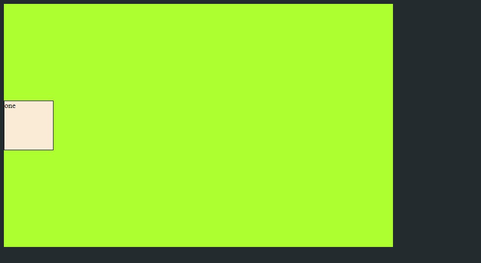
7.align items
align-items property align grid items along the block(column) axis. This value is applied to all grid items present in the grid.
Values are same as justify-items:
stretch – fills the whole height of the cell (this is the default)
start – aligns items to be flush with the start edge of their cell
end – aligns items to be flush with the end edge of their cell
center – aligns items in the center of their cell
.container {
  align-items: start | end | center | stretch;
}
Example:
 <style>
            body {
                background: #242B2E;
                ;
            }

            .container {
                height: 500px;
                width: 800px;
                background-color: greenyellow;
                display: grid;
                grid-template-columns: 1fr ;
                align-items: center;
            }

            .one {
                background-color: antiquewhite;
                border: 1px solid black;
                height: 100px;
                width: 100px;
            }
        </style>
<div class="container">
        <div class="one">one</div>
</div>
Output:
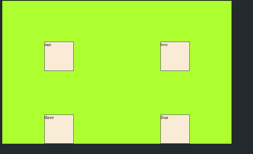
8. place-items
Shorthand to apply both justify-items and align-items in single declaration.
Values are:
/ – The first value sets align-items, the second value justify-items. If the second value is omitted, the first value is assigned to both properties.
.container {
  display: grid;
  place-items: center;
}
Example:
  <style>
.container {
                height: 500px;
                width: 800px;
                background-color: greenyellow;
                display: grid;
                grid-template-columns: 1fr 1fr;
                grid-row: auto;
                row-gap: 10px;
                gap:10px 10px;
                place-items: end center;
            }
           .one {
                background-color: antiquewhite;
                border: 1px solid black;
                height: 100px;
                width: 100px;
            }
                </style>
<body>
    <div class="container">
        <div class="one">one</div>
        <div class="one">two</div>
        <div class="one">three</div>
        <div class="one">four</div>
    </div>
</body>
Output:
9. justify-content
justify-content property is used to set the alignment of the grid along with inline(row) axis within the grid container. Sometimes the total size of your grid might be less than the size of its grid container. This could happen if all of your grid items are sized with non-flexible units like px. In this case by using justify-content property you can set the alignment of the grid within the grid container.
values for justify-content are:
start – aligns the grid to be flush with the start edge of the grid container
end – aligns the grid to be flush with the end edge of the grid container
center – aligns the grid in the center of the grid container
stretch – resizes the grid items to allow the grid to fill the full width of the grid container
space-around – places an even amount of space between each grid item, with half-sized spaces on the far ends
space-between – places an even amount of space between each grid item, with no space at the far ends
space-evenly – places an even amount of space between each grid item, including the far ends
.container {
  justify-content: start | end | center | stretch | space-around | space-between | space-evenly;
}
Example:
<style>
            body {
                background: #242B2E;
                ;
            }

            .container {
                height: 500px;
                width: 800px;
                background-color: greenyellow;
                display: grid;
                grid-template-columns: 20px 20px 20px;
                grid-row: auto;
                justify-content: space-evenly;
            }

            .one {
                background-color: antiquewhite;
                border: 1px solid black;
                height: 100px;
                width: 100px;
            }
        </style>

<body>
    <div class="container">
        <div class="one">one</div>
        <div class="one">two</div>
        <div class="one">three</div>
        <div class="one">four</div>
        <div class="one">five</div>
        <div class="one">six</div>
    </div>
</body>
Output:
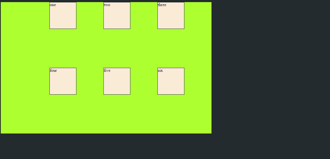 In above example we have used justify-content: space-evenly; property which have added the space between each grid item including the far ends.
10. align-content
This property aligns the grid along the block (column) axis, same as justify content which align on inline(row axis).
Values are same as :
start – aligns the grid to be flush with the start edge of the grid container
end – aligns the grid to be flush with the end edge of the grid container
center – aligns the grid in the center of the grid container
stretch – resizes the grid items to allow the grid to fill the full height of the grid container
space-around – places an even amount of space between each grid item, with half-sized spaces on the far ends
space-between – places an even amount of space between each grid item, with no space at the far ends
space-evenly – places an even amount of space between each grid item, including the far ends
.container {
  align-content: start | end | center | stretch | space-around | space-between | space-evenly;
}
Example:
  <style>
            body {
                background: #242B2E;
                ;
            }

            .container {
                height: 500px;
                width: 800px;
                background-color: greenyellow;
                display: grid;
                grid-template-columns: 1fr 1fr 1fr;
                grid-row: auto;
                gap:10px 10px;
                align-content: end;

            }

            .one {
                background-color: antiquewhite;
                border: 1px solid black;
                height: 100px;
                width: 100px;
            }
        </style>
<body>
    <div class="container">
        <div class="one">one</div>
        <div class="one">two</div>
        <div class="one">three</div>
        <div class="one">four</div>
        <div class="one">five</div>
        <div class="one">six</div>
    </div>
</body>
Output:
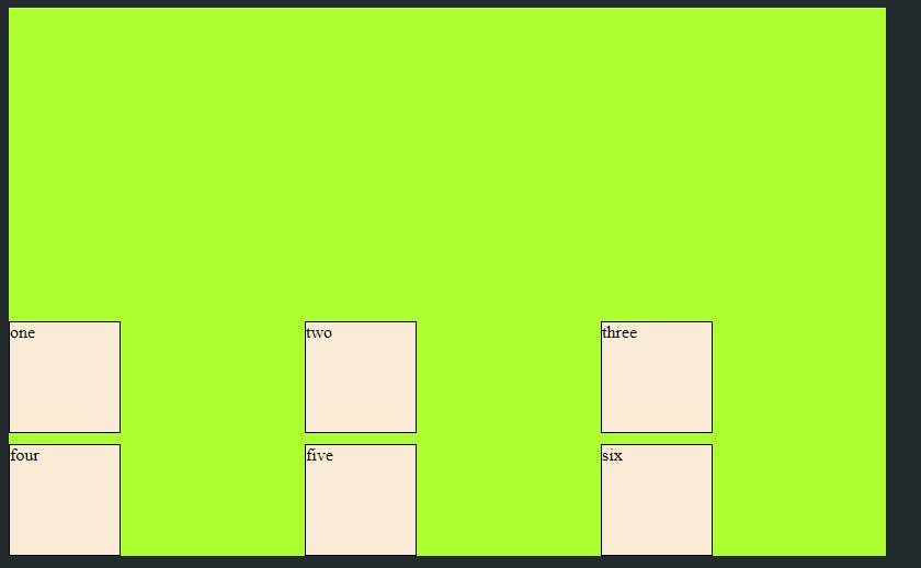 In above example we have use align-content: end; property.
CSS Grid properties for the Child Container
grid-column-start/grid-row-start
Determine the grid item's location within the grid, grid-column-start/grid-row-start is the line where the item begins
grid-column-end/grid-row-end is the line where the item ends
Values are:
– can be a number to refer to a numbered grid line, or a name to refer to a named grid line
span – the item will span across the provided number of grid tracks
span – the item will span across until it hits the next line with the provided name
auto – indicates auto-placement, an automatic span, or a default span of one
.item {
  grid-column-start: <number> | <name> | span <number> | span <name> | auto;
  grid-column-end: <number> | <name> | span <number> | span <name> | auto;
  grid-row-start: <number> | <name> | span <number> | span <name> | auto;
  grid-row-end: <number> | <name> | span <number> | span <name> | auto;
}
Example:
 <style>
            body {
                background: #242B2E;
                ;
            }

            .container {
                height: 500px;
                width: 800px;
                background-color: greenyellow;
                display: grid;
                grid-template-columns: 1fr 1fr 1fr 1fr 1fr;
                grid-row: auto;
                gap:10px 10px;

            }

            .one {
                background-color: antiquewhite;
                border: 1px solid black;
                /* height: 100px;
                width: 100px; */
            }
            .start{
                background-color: antiquewhite;
                border: 1px solid black;
                grid-column-start: 1;
                grid-column-end: 6;
            }
        </style>

<body>
    <div class="container">
        <div class="one start">one</div>
        <div class="one">two</div>
        <div class="one">three</div>
        <div class="one">four</div>
        <div class="one">five</div>
        <div class="one">six</div>
    </div>
</body>
Output:
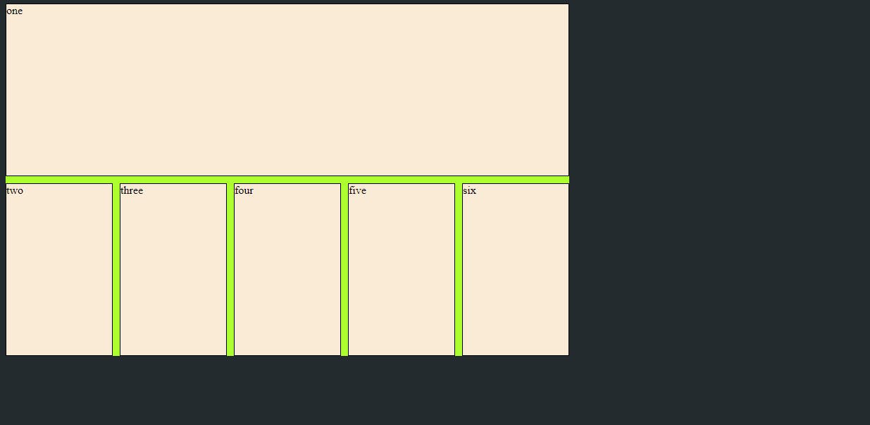
In above example we have started the div 1 from column 1 and end it to column 6.
grid-column / grid-row
Is the shorthand for the grid-column-start and grid-column-end, grid-row-start and grid-row-end respectively.
Values are:
/ – each one accepts all the same values as the longhand version, including span
.item {
  grid-column: <start-line> / <end-line> | <start-line> / span <value>;
  grid-row: <start-line> / <end-line> | <start-line> / span <value>;
}
Example:
 grid-column: 1/6;

// Same thing like
grid-column-start: 1;
grid-column-end: 6;
// from above example
Output: will be same as above.
justify self
justify-self property align the grid item inside the grid container along the inline(row) axis. This value applies to the specified grid item inside a single cell.
Values are:
start – aligns the grid item to be flush with the start edge of the cell
end – aligns the grid item to be flush with the end edge of the cell
center – aligns the grid item in the center of the cell
stretch – fills the whole width of the cell (this is the default)
.item {
  justify-self: start | end | center | stretch;
}
align-self
align-self property align the grid item inside the grid container along the block(column) axis. This value applies to the specified grid item inside a single cell.
Values are:
start – aligns the grid item to be flush with the start edge of the cell
end – aligns the grid item to be flush with the end edge of the cell
center – aligns the grid item in the center of the cell
stretch – fills the whole height of the cell (this is the default)
.item {
  align-self: start | end | center | stretch;
}
Example justify and align self:
 <style>
            body {
                background: #242B2E;
                ;
            }

            .container {
                height: 500px;
                width: 800px;
                background-color: greenyellow;
                display: grid;
                grid-template-columns: 1fr 1fr 1fr 1fr 1fr;
                grid-row: 1fr 1fr 1fr;
                gap:10px 10px;
            }

            .one {
                background-color: antiquewhite;
                border: 1px solid black;

            }
            .start{
                background-color: antiquewhite;
                border: 1px solid black;
                justify-self: end;
                align-self: end;
                height: 100px;
                width: 100px;
            }
        </style>

<body>
    <div class="container">
        <div class="one start">one</div>
        <div class="one">two</div>
        <div class="one">three</div>
        <div class="one">four</div>
        <div class="one">five</div>
        <div class="one">six</div>
    </div>
</body>
Output:
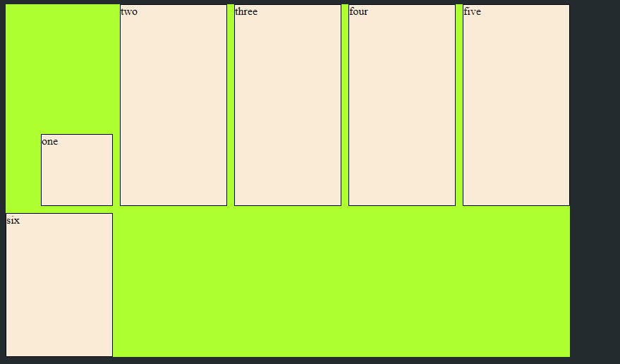
In above example we have used both align-self and justify-self to end for 1st element.
place-self
place-self sets both the align-self and justify-self properties in a single declaration.
Example:
// from above example just replace

justify-self: end;
align-self: end;

// this two lines with

place-self: end;
Output:
will be same as above.