


Pseudo-elements
Pseudo elements is used to apply styling to specified part of the selected element.
For example to style the first line of the paragraph you can use :: first-line and now you can do whatever styling you want to do on first line of the paragraph.
This article is about the elements like this which called as pseudo elements.
Syntax
selector::pseudo-element {
  property: value;
}

// Example

 p::first-letter {
        background-color: greenyellow;
    }
// which target the first letter of the paragraph
You can use only one selector at a time which will appear after the simple selector.
Some elements are
::after
::after is used to insert something after(as a last child) the selected element and that something can be mention with the property content . Content is the property to specify the content to insert.
::before
::before is used to add something before(as a first child) the selected element. Same as ::after
Example:
<style>
 .one::after {
        content: 'I am added using ::after';
        font-size: 18px;
        color: #ffffff;
    }
    .two::before {
        content: 'I am added using ::before';
        font-size: 18px;
        color: #ffffff;
    }
</style>

<body>
<p class="one">Paragraph one</p>
<p class="two">Paragraph two</p>
</body>
Output:
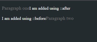
In above example we have two paragraphs. For first paragraph we have used the ::after element through which we have added some teat after the first paragraph using content property. Same we have done in second paragraph by using ::before element we have added some text before the second paragraph.
Now you will think why this get added in the same line, because those element have display as inline by default. If you want text into new line you can simply add the below property.
display: block;
We can style text or images in the content property almost any way we want.
::first-letter
::first-letter the name says itself it applies style to the first letter of the first line of the block level element... yes the block level elements, but only when not preceded by other content and not the inline elements
Example:
<style>
 p::first-letter {
  color: white;
  background-color: black;
  border-radius: 2px;
  box-shadow: 3px 3px 0 red;
  font-size: 250%;
  padding: 6px 3px;
  margin-right: 6px;
  float: left;
}
</style>

<body>
<p class="one">Paragraph one</p>
</body>
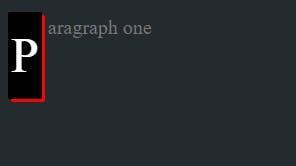
In above example we have targeted the first letter of the paragraph.
::first-line
Same as first-letter we have ::first-line to target the first line of the paragraph.
Syntax
::first-line
::marker
::marker to selects the marker box of the list item, which typically contain the bullet or a number.
It works on any element or pseudo-element set to display: list-item, such as the <li> and <summary> elements.
Example:
<style>
ul li::marker{
color: red;
}
</style>
<body>
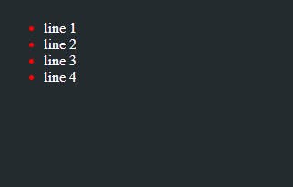
<ul>
<li>line 1</li>
<li>line 2</li>
<li>line 3</li>
<li>line 4</li>
</ul>
</body>
Output:
::selection
::selection is used to apply the style to the part of the document that is highlighted by the user (such as clicking and dragging the mouse across text).
Example:
<style>
p::selection{
    background-color: yellow;
    color: black;
}
</style>

<body>
<p class="one">Paragraph one</p>
</body>
Output:
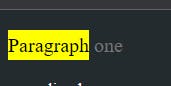
If you highlight the text from the paragraph the background color and the color of the text will get chage.
Pseudo-classes
Pseudo class specify the special state of the selected elements. For example, the pseudo-class :hover can be used to select a button when a user's pointer hovers over the button and this selected button can then be styled.
Syntax
selector:pseudo-class {
  property: value;
}

//example

button:hover {
color:red;
}

// on button hover the button text color will be change to red
A pseudo class consist colon (:) followed by the pseudo-class name.
Input pseudo-classes
:autofill
Matches when an has been autofilled by the browser.
:enabled
Represents a user interface element that is in an enabled state.
Example:
input:enabled {
    background-color: gold;
}

 <input type="text" name="" id="" disabled="true">
:disabled
Represents a user interface element that is in a disabled state.
Example:
input:disabled{
    border: 4px solid red;
}
 <input type="text" name="" id="" disabled="true">
: read-only
The :read-only class represents an element (such as input or textarea) that is not editable by the user.
*:read-only {
    color: aqua;
}
:read-write
Represents any element that is user-editable.
*:read-write {
    color: aqua;
}
:placeholder-shown
Represents any or
input:placeholder-shown {
height: 30px;
}
:checked
Matches when elements such as checkboxes and radio buttons are toggled on.
:indeterminate
Matches UI elements when they are in an indeterminate state.
:valid
Matches an element with valid contents. For example, an input element with the type 'email' that contains a validly formed email address or an empty value if the control is not required.
:invalid
Matches an element with invalid contents. For example, an input element with type 'email' with a name entered.
:required
Matches when a form element is required.
User action pseudo-classes
These pseudo-classes require some interaction by the user in order for them to apply, such as holding a mouse pointer over an element.
:hover
Matches when a user designates an item with a pointing device, such as holding the mouse pointer over the item.
button:hover{
color:pink,
background-color:yellow
:active
Matches when an item is being activated by the user. For example, when the item is clicked on.
button:active{
background-color: pink
}
:focus
Matches when an element has focus.
button:focus{
background-color: yellow
}
GitHub Link: